Catalog ads all start from the same raw material - a product, a price, an image - which is exactly why the interesting question is what winning ones do differently. Below are twenty examples worth stealing, organized by what the campaign is trying to achieve.
Each example notes the feed mechanic behind it, because that's what makes these scalable: none of them are hand-made ads. They're templates rendering catalog data, which means every one applies to 40 products or 4,000. The system behind that is covered in catalog ad design; this article is pure inspiration.
Sale and promotion examples
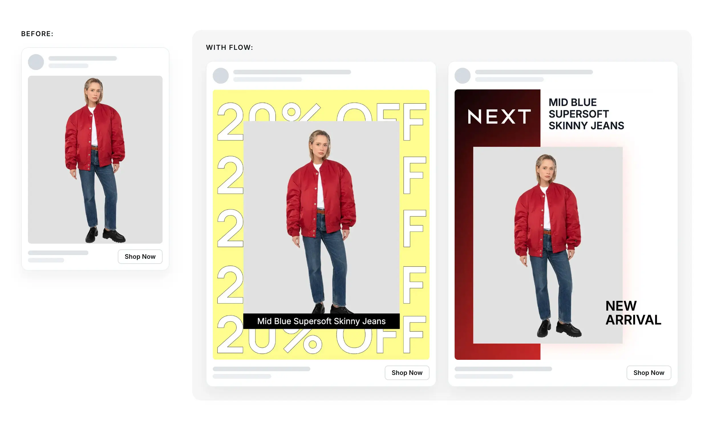
1. The strikethrough carousel. Original price crossed out, sale price large, per card. The feed mechanic: price + sale_price rendering together. The classic for a reason - it answers "what's the deal?" without a tap.
2. The computed discount badge. A "-40%" roundel in the corner, calculated from the price fields so it's always accurate and only appears where true. Works because percentages read faster than price math.
3. The category takeover. Every product in a collection gets the same sale background and frame - the feed's category or label field decides who's in. Paolo Botticelli's Summer Sale across 4,000+ products is this pattern at full scale: one design, one label, an entire catalog campaign-dressed overnight.
4. The last-days urgency frame. A "Final days" ribbon added by switching template variants near the end of a promotion - no per-product edits, one template swap.
5. The price-drop spotlight. Single-product ad with "Was €79 / Now €49" as the visual centerpiece. Test it with retargeting audiences who previously saw the product at full price.
New arrival examples
6. The "New in" grid. A badge driven by a custom_label or created-date rule, so new products self-identify in every carousel. Freshness without a launch campaign.
7. The collection launch carousel. First card is a designed hero (collection name, mood), following cards are products from the collection's product set. One campaign, editorial front, catalog depth behind it.
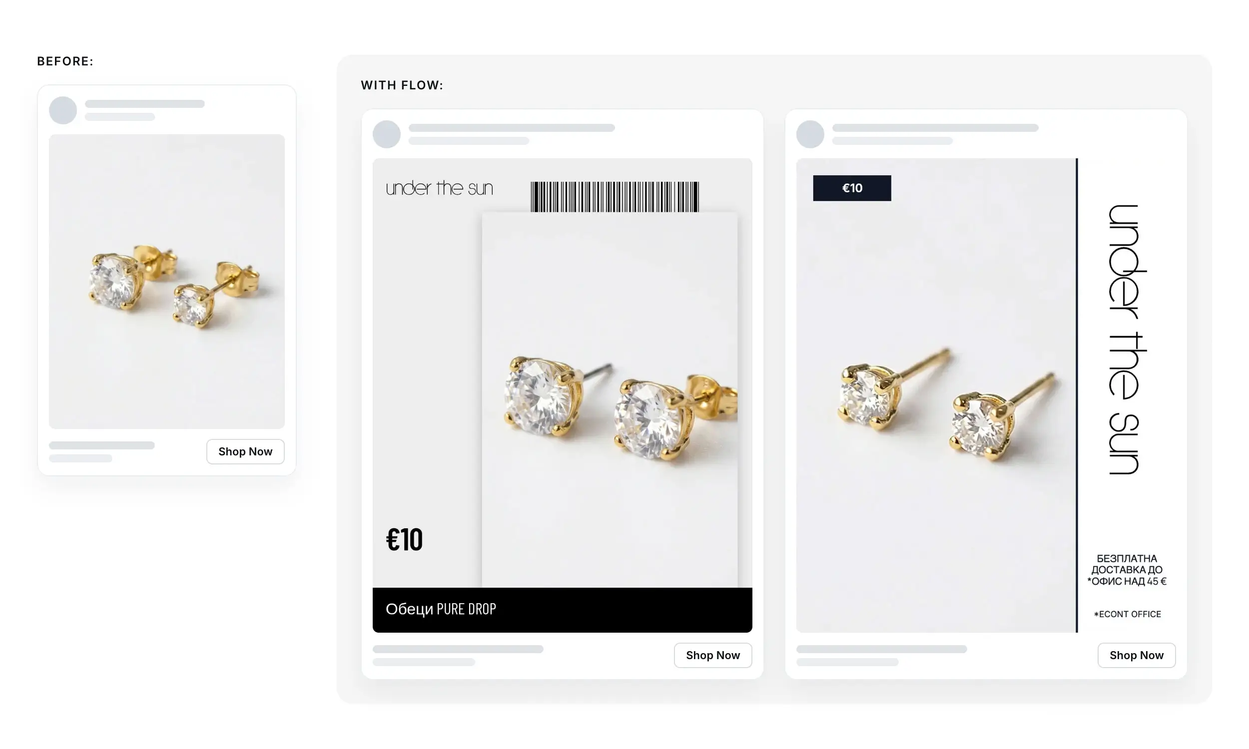
8. The lookbook frame. Products rendered on lifestyle or textured backgrounds with editorial typography - catalog data wearing magazine clothes. Under The Sun's 1,500+ product transformation shows how far from "database row" a feed-driven ad can look.
Social proof examples
9. The rating-stars card. Star rating and review count rendered from feed fields (average_review_rating, number_of_reviews, which Pinterest supports). Use only current, policy-compliant review data and validate the render.
10. The bestseller label. "Bestseller" appears only on products a sales-rank label marks - scarcity of the badge is what keeps it credible.
11. The UGC-style frame. The product photo inside a casual, phone-shot-style layout - handheld angle, natural shadow, minimal typography. Reads native in feeds where polished ads get scrolled past.
Brand and category examples
12. The signature-frame carousel. Every card shares one unmistakable brand element - a color band, a corner logo, a typographic style. The example in our catalog ads guide is a Meta carousel by Under The Sun doing exactly this.
13. The color-block category ad. Background color changes by category (skincare mint, fragrance blush) via a label-driven template rule. The catalog becomes visually navigable in-feed.
14. The background swap. Product cutout (background removed) placed on a seasonal or branded backdrop. The mechanic that unlocks examples 3, 8, and 13 - and why background removal belongs in the creative pipeline, not Photoshop.
Retargeting examples
15. The exact-item reminder. Dynamic retargeting serving the precise viewed product, enriched with current price and a soft nudge ("Still thinking it over?"). The mechanics live in dynamic product ads.
16. The complete-the-look carousel. Viewed product first, complementary products (same item_group_id family or a curated set) behind it. Cross-sell built from catalog structure.
17. The back-in-stock alert. Products flipping from out of stock to in stock can enter an "It's back" template via availability rules. Test this specific audience and treatment separately from general retargeting.
Format-native examples
18. The 9:16 spotlight. One product, full-screen vertical, price inside the safe zone, designed for Reels and Stories rather than cropped into them. The aspect-ratio rules are the difference between native and salvaged.
19. The 2:3 editorial pin. Portrait render with lookbook framing for Pinterest's grid, where square creative occupies less vertical space. Treat editorial styling versus promotional overlays as an A/B test, not a settled performance rule.
20. The animated price reveal. A catalog video: product image scales in, price and badge animate on, inside a branded motion template. Motion from static assets - TikTok's format rules practically demand it.
[Image suggestion: per-section gallery sliders (5 sale examples as one slider, etc.) so each goal cluster is browsable; every example rendered on the same fictional product line for comparability.]
How to steal these
Every example above decomposes into the same three ingredients:
A feed field that triggers it -
sale_price, a label, availability, a ratingA template layer that renders it - badge, frame, background, animation
A product set that scopes it - who gets this treatment
Which means implementation isn't twenty projects; it's one template system with twenty configurations. Pick the three examples that match your next campaign, check the feed fields they need are filled, and build those templates first.
Turning these examples into reusable templates
Treat the examples above as template briefs rather than finished ads to copy. In Flow's creative studio, reusable templates, brand assets, background removal, product-driven content, and variations provide the building blocks; three examples also link directly to Flow customer case studies.
Choose the pattern that matches the campaign's job, confirm that its required fields and conditional behavior are supported, and build it on a small product set first. That turns inspiration into a reviewable production test before it reaches the whole catalog.
FAQ
What makes a good catalog ad?
It answers the buyer's half-second questions inside the creative: what is it, what does it cost, what's the deal, why this brand. The examples above are twenty ways of doing that with data the feed already holds.
Can I use these examples without designing each ad by hand?
That's the premise - each one is a template pattern rendering feed data, so it applies across the whole catalog and updates itself when products change.
Which example should I try first?
If you run promotions: start by testing the strikethrough carousel (1) plus the discount badge (2). If you don't, test the signature-frame carousel (12). They are relatively low-complexity starting points; verify impact in your own campaign rather than assuming a universal winner.
Do these work on every platform?
The enriched examples fit Meta, TikTok, Snapchat and Pinterest - rendered in each platform's native ratio. Google Shopping requires clean, overlay-free images, so keep these in the ad layer and out of your Google feed.
Final thoughts
Inspiration in catalog advertising isn't about art direction on one hero ad - it's about patterns that survive multiplication across a catalog. All twenty examples here are exactly that: a feed field, a template rule, and a product set, dressed twenty different ways.
Steal liberally. The catalog does the repetition; the pattern does the persuasion.


Join The Newsletter
Stay ahead in catalog advertising
Get practical guides, product updates, new templates, and best practices for Dynamic Product Ads, creative automation, and ecommerce marketing.
On this page
Related articles



Launch catalog ads with ease
Ready to launch better catalog ads?
Turn product catalogs into publishing-ready creatives in minutes.