Aspect ratio is the most underrated setting in ad creative. The same product, the same design, the same budget - and a 4:5 version takes up 25% more screen than the 1:1, while a square pin on Pinterest quietly loses a third of the space its 2:3 neighbors get.
Most guides explain one ratio at a time. This one covers the whole system: what each ratio is, where it serves, the minimum sizes platforms enforce in 2026, and how to produce every format from one design instead of four.
Aspect ratio in 30 seconds
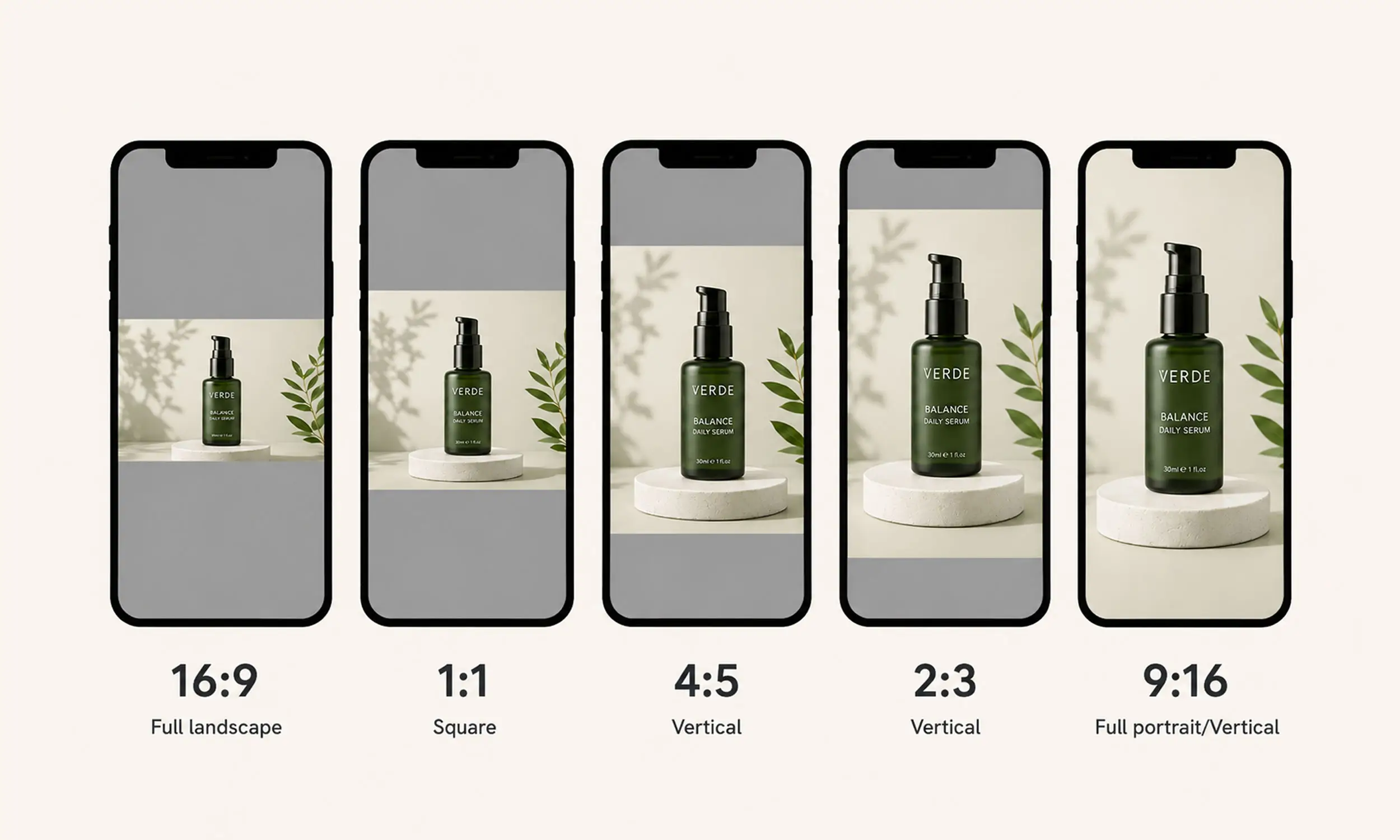
Aspect ratio is width to height. 1:1 is a square. 4:5 is slightly taller than wide. 9:16 is a full vertical phone screen. 16:9 is a horizontal video frame. 2:3 is portrait, between 4:5 and 9:16.
Two rules govern everything else:
Many mobile feeds are vertical, so portrait creative occupies more vertical screen space than landscape creative. The platforms reviewed here generally recommend portrait or square assets for their core feed placements.
Platforms crop what doesn't fit. If you provide only one ratio, the platform adapts it per placement - and automatic cropping doesn't know where your product or price sits.
1:1 - the square default
A broadly supported fallback across the destinations reviewed here. If you can produce only one ad asset, a high-resolution square avoids some compatibility problems, but it will not fill vertical placements.
Meta: catalog images display square in Shops; minimum 500 x 500 pixels, 1024 x 1024 recommended, per Meta's image specifications
TikTok: catalog images minimum 500 x 500, JPEG/PNG
Google Shopping: a 500 x 500 minimum for all categories and marketing methods takes effect January 31, 2027; warnings began April 14, 2026
Pinterest: square is accepted for some ad formats, but the primary catalog image now has a separate minimum of 1000 x 1500 and 2:3 occupies more of the grid
Use it for: catalog feed images, carousel cards, and anywhere you need one image to work everywhere.
4:5 - the feed maximizer
Portrait-lite. On Facebook and Instagram feed placements, 4:5 is the tallest image ratio that renders without cropping - it simply gets more pixels than a square for the same impression.
Meta: supported in feeds and carousels; carousel cards must all share one ratio - all 1:1 or all 4:5 - or Meta may auto-adjust every card
Meta product videos: 4:5 is the recommended default for catalog video files
Pinterest: accepted for video (1:1, 2:3, 4:5, 9:16 all supported)
Use it for: Meta feed creative and product video. If your catalog creative pipeline renders two ratios, make them 1:1 and 4:5.
2:3 - the Pinterest native
The ratio multi-platform advertisers forget. Pinterest's grid is built for portrait pins, and its official ad specs recommend 2:3 at 1000 x 1500 pixels for standard and shopping ads. Its current catalog specification separately requires the primary image_link to be at least 1000 x 1500.
A square image in that grid isn't rejected - it's just smaller than everything around it. If you run Pinterest catalog ads, 2:3 is the difference between looking native and looking syndicated.
Use it for: everything on Pinterest; editorial and lookbook-style product creative.
9:16 - the full-screen vertical
The whole phone screen: Reels, Stories, and TikTok. This is where static product photos struggle and designed creative earns its keep.
The catch is interface overlap. On 9:16 surfaces, profile icons, captions, and CTA buttons cover parts of the image - Meta's specs note that interface elements cover portions of 9:16 creative on Reels and Stories. Keep the product, price, and any text inside the central safe area, roughly the middle 80% vertically and away from the right edge.
TikTok adds motion requirements: Catalog Ads video must run 5-60 seconds, include audio, and stay dynamic - static imagery can't exceed half the video.
Use it for: Reels, Stories, TikTok - designed or animated creative, never a stretched square.
16:9 - the horizontal exception
Landscape, inherited from television and desktop video. In product advertising it's a niche: in-stream video placements, desktop banners, YouTube. In mobile feeds it's the weakest format on the page - a thin strip between taller neighbors.
Use it for: video placements that require it. Don't spend catalog-creative effort here first.
Aspect ratio | Meta feed | Meta carousel | Reels / Stories | TikTok | Google Shopping | |
|---|---|---|---|---|---|---|
1:1 | Accepted | Recommended | Accepted | Accepted | Accepted | Recommended |
4:5 | Recommended | Recommended | Accepted | Depends on format | Accepted | Accepted |
2:3 | Poor fit | Poor fit | Accepted | Depends on format | Recommended | Accepted |
9:16 | Poor fit | Poor fit | Recommended | Recommended | Depends on format | Depends on product |
16:9 | Accepted | Accepted | Poor fit | Accepted | Depends on format | Accepted |
Best default set: 1:1 for reusable and product assets, 4:5 for Meta feeds, 2:3 for standard Pinterest Pins, and 9:16 for Reels, Stories and TikTok.
The cheat sheet
Catalog feed images: Meta and TikTok require at least 500 x 500; Pinterest's primary image requires at least 1000 x 1500; Snapchat permits 200 x 200 but larger source files give more output flexibility
Meta feed and carousel: 1:1 or 4:5, consistent across carousel cards
Reels, Stories, TikTok: 9:16 with safe-zone-aware design; video 5-60s with audio on TikTok
Pinterest: 2:3 at 1000 x 1500
Google Shopping: clean 1:1 product photos, no promotional overlays - Google disapproves images with promo text
Video: 4:5 default for Meta catalog video; vertical for TikTok and Pinterest
Producing every ratio without multiplying the work
Here's the operational problem: five hundred products times four ratios is two thousand images - and two thousand re-edits every time a price or season changes. Nobody crops their way through that.
The answer is the same template approach that powers enriched catalog ads. You design the layout once per ratio - where the product sits, where the price renders, how the background extends - and the creative generates from the feed for every product in every format. Vertical formats aren't crops of the square; they're their own layouts with the same design system, safe zones respected, product scaled correctly.
That's how one catalog produces native-looking creative for Meta, TikTok, and Pinterest simultaneously, and it's the approach behind catalog ads at scale generally: data decides the content, templates decide the geometry.
Producing every ratio without manual resizing
The ratio problem is not four exports; it is maintaining four compositions every time the catalog changes. In Flow's creative studio, one design system can become sibling layouts, so the product, price, and promotional elements are positioned deliberately for square, portrait, and vertical formats instead of being cropped blindly.
Under The Sun used reusable templates across 1,500+ products. The case study supports catalog-scale production reuse; the value of each ratio still needs to be measured in your own placement breakdowns.
FAQ
What's the best aspect ratio for Facebook and Instagram ads?
4:5 for feed placements - it's the tallest un-cropped image format and occupies the most screen. Use 1:1 for catalog images and carousels (all cards in one ratio), and 9:16 for Reels and Stories.
What aspect ratio does Pinterest use?
2:3 portrait, recommended at 1000 x 1500 pixels. Square images serve but appear smaller in Pinterest's grid.
What size should catalog product images be?
Meta and TikTok require at least 500 x 500, while Pinterest's primary catalog image requires at least 1000 x 1500. Google moves to a universal 500 x 500 minimum on January 31, 2027. Use larger source files where possible so one source can support multiple crops and placements.
Can I use one image for all placements?
You can - a high-resolution 1:1 is the safest single asset - but you're accepting automatic cropping on vertical surfaces. Templated per-ratio rendering gets you native formats without per-product work.
Is 16:9 worth producing for product ads?
Only where a placement requires it (in-stream video, desktop display). For feed-based product advertising, portrait and square formats earn more screen per impression.
Final thoughts
Aspect ratios aren't a design detail - they're distribution. The ratio decides how much screen you get, whether your creative looks native or syndicated, and whether a platform's crop lands on your product or your price.
Treat formats as outputs of one system: one design concept rendered per ratio from the feed, with safe zones respected. This reduces repeated manual resizing while preserving placement-specific geometry.


Join The Newsletter
Stay ahead in catalog advertising
Get practical guides, product updates, new templates, and best practices for Dynamic Product Ads, creative automation, and ecommerce marketing.
On this page
Related articles



Launch catalog ads with ease
Ready to launch better catalog ads?
Turn product catalogs into publishing-ready creatives in minutes.